
What’s Inside
- Nail The Dimensions For Your Workout Playlist Cover
- Make The Typography Actually Readable
- Use High Color Contrast For Instant Recognition
- Sneak In Your Branding Without Being Annoying
- Hack Your Brain With Color Psychology
- Try The Naive Design Trend For Your Workout Playlist Cover
- Use Collage And Layered Elements
- Don’t Steal Copyrighted Images (Seriously)
- Keep The Layout Simple And Scannable
- Hire A Pro For The Big Playlists
- Add A Human Touch To Beat AI Slop
I stared at my phone screen last Tuesday at Whole Foods, totally missing the organic apples right in front of me. I couldn’t find my heavy lifting mix, and that’s when it hit me: a custom workout playlist cover isn’t just for fitness influencers. It’s a tool so you aren’t scrolling through identical gray squares while your $39.99 pre-workout powder kicks in. I used to let Spotify pick a random collage of album art for my gym mixes. Massive mistake. I’d spend five minutes squinting at my screen in the gym parking lot, wasting time when I should’ve been warming up. A good cover acts like a visual trigger. You see it, your brain knows it’s time to sweat, and you get moving. I’ve spent the last six months testing different apps, formats, and color schemes to see what actually works on a tiny phone screen. Skip the generic stock photos of dumbbells. They look like cheap textbook covers. Let’s build something you actually want to tap. I’m going to show you how I design my covers, the apps I use, and the embarrassing design mistakes I made—took me years to figure out—so you don’t have to repeat them.
1. Nail The Dimensions For Your Workout Playlist Cover

If you mess up the file size, nothing else matters. I tried uploading a tiny 300×300 pixel image I saved from Google Images a few years ago. It looked like a blurry, pixelated Minecraft block on my car’s dashboard. For the best display on Spotify, you need a 3000×3000 pixel image with a strict 1:1 aspect ratio. Apple Music actually likes 4000×4000 pixels. You also have to keep the file size under 4MB for Spotify, saved as a standard JPG. I pay $9.99 a month for Adobe Photoshop just to get the export settings crisp, but you don’t have to spend that much. I was standing in Target buying a $25 Apple gift card to pay for some app subscriptions when I finally figured out the 1:1 aspect ratio rule. I kept trying to upload rectangular photos from my iPhone camera roll, and the app kept awkwardly cropping my head out. Always start with a massive, high-resolution base image. Even if the platform scales it down, starting at 4000×4000 pixels keeps your text edges sharp. Don’t rely on low-res memes. They look terrible when you cast your phone to a smart TV during a home workout.
2. Make The Typography Actually Readable

There’s a big trend for 2026 pushing exaggerated, playful letters and chaotic text. Ignore it if you want your playlist to be functional. I tried using a messy, dripping horror font for my Halloween deadlift playlist. I couldn’t read a single word of it while squinting on a treadmill at Planet Fitness under those blinding fluorescent lights. Your text needs to be legible at thumbnail size. I use Canva Pro for $14.99 a month because they have clean, bold sans-serif fonts. Put your title dead center. Use a font size that takes up at least a third of the image height. If you’re using a busy background photo of a gym floor, put a solid black box behind your text and drop the opacity to 70 percent. This creates a readable contrast block. I’ve seen guys use thin cursive fonts for their yoga playlists. It looks like a doctor’s prescription scribbled on a napkin. Keep it bold, blocky, and thick. You’re designing a billboard for a highway, not a wedding invitation.
3. Use High Color Contrast For Instant Recognition

You need colors that punch you in the face. I’m talking aggressive, high color contrast. If you use a dark gray font on a black background, your playlist will vanish into the dark mode interface of your music app. I learned this the hard way. I made a sleek, all-black cover for my 5 AM cardio mix. I literally couldn’t find it in my library when I was half asleep. I bought a pack of $3.99 neon Sharpie highlighters at Walmart just to sketch out color blocking ideas on paper. You want opposite colors on the color wheel. Think bright yellow text on a deep purple background, or a stark white font against a blood-red texture. I have a $35 neon green Under Armour compression shirt that I use as my visual benchmark. If my playlist cover doesn’t pop as loudly as that shirt under gym lights, I redesign it. Our eyes are biologically trained to lock onto contrasting colors. Use this. A bright, contrasting thumbnail stands out in search results and makes it foolproof to tap the right mix when your hands are covered in chalk. You might also like: 15 Brilliant Dark Basements Home Gym Setup Ideas Worth Trying This Year

FLYBIRD WB2 Weight Bench
A dependable everyday pick — FLYBIRD WB2 Weight Bench pulls in 215 ratings at 4.5 stars. Not flashy, just solid.
4. Sneak In Your Branding Without Being Annoying

If you’re a personal trainer or fitness coach, your playlist covers are free advertising. But be smart about it. I made the mistake of slapping my giant face and my coaching logo right in the middle of a public playlist. It looked like a cheap infomercial. Nobody wants to save a playlist that looks like an aggressive billboard. I use the Spotiplus app (the pro version is $4.99) to manage my layouts. The golden rule for Spotify is to keep your personal logo tucked neatly into the top-left corner. Keep it small. Let the vibe of the playlist take center stage. I use consistent fonts across all my public mixes so my clients know it’s my list. I usually add a tiny 1-inch watermark of my kettlebell logo in the corner. It builds brand identity without screaming for attention. When I first started, I used four different logos and seven different fonts across my profile. It looked like a messy garage sale of digital art. Pick one clean logo, put it in the corner, and leave it alone. You might also like: 15 Clever Garage Home Workout Ideas That Are Totally Worth It
5. Hack Your Brain With Color Psychology

Color psychology directly influences your heart rate and perceived exertion. I thought this was pseudo-science until I tested it. I was drinking a $2.50 Gatorade Fierce Melon at Kroger when I realized the bright red color actually made me feel more alert. Red and orange evoke energy, excitement, and aggression. I use deep, vibrant reds exclusively for my high-intensity interval training and one-rep max playlists. It signals to my brain that it’s time to suffer. On the flip side, I use greens and cool blues for my mobility and active recovery days. Green promotes themes of balance and health. It actually helps reduce perceived tiredness when I’m grinding through a 45-minute stretching routine. I tried putting a calming pastel blue cover on my heavy squat playlist once. It completely killed my vibe. I felt like I was getting ready for a nap instead of a heavy lift. Match the chemical reaction you want in your brain to the primary color of your cover art. Don’t mix aggressive death metal with a soft pink background unless you’re going for deep irony. You might also like: 20 Gorgeous Garage Home Gym Setup Ideas to Steal Right Now
6. Try The Naive Design Trend For Your Workout Playlist Cover

There’s a big design shift toward naive design. This trend embraces imperfection, awkward proportions, and visible human error. It’s a direct rebellion against the overly polished, plastic-looking AI art flooding the internet. I swear by this method. I bought a $129 Apple Pencil at Costco last month and started drawing my own covers directly on my iPad. I draw uneven, messy letters and stick-figure dumbbells. It looks like a high school notebook doodle, and people absolutely love it. The rough edges and uneven handwriting add warmth and individuality. I used to spend hours trying to make perfect geometric shapes in Illustrator. Now, I intentionally make things look a little rough. I’ll draw a jagged lightning bolt and leave the coloring outside the lines. It feels raw. It feels like a real human made it in a dirty gym, not a robot in a server farm. If you can’t draw, just write the title in your own handwriting on paper, take a photo, and use that. It’s wildly effective.

OLIXIS Adjustable Weight Bench for Full Body Strength
OLIXIS Adjustable Weight Bench for Full Body Strength Training has been one of the most consistently praised picks in this category. 31 reviewers averaged 4.5/5.
7. Use Collage And Layered Elements

Flat designs are boring. You need texture. I’m a huge fan of collage and layered visual elements. I use Adobe Express, which has a fantastic $9.99 premium tier, to stack different textures on top of each other. I’ll take a black-and-white photo of a barbell, layer a ripped paper texture over it, and then stamp a bright red title on top. I literally ripped up old fitness magazines in my living room, took photos of the torn edges, and imported them as PNG files. The caramel-butter smell of those dusty old magazine pages always reminds me of my first gym membership. Adding depth and narrative to your covers makes them feel like physical objects. You can layer doodles, digital stamps, and rough brush textures to create a chaotic, maximalist layout that fits the energy of a hard workout. I tried making a clean, minimalist white cover once. It looked like a sterile hospital waiting room. Your gym mix should look sweaty, gritty, and layered. Stack three or four distinct visual elements to give the eye something to explore.
8. Don’t Steal Copyrighted Images (Seriously)

I learned this lesson the hard way. I grabbed a sick photo of Arnold Schwarzenegger from Google, slapped some text on it, and used it as my public playlist cover. Three days later, I got a takedown notice from Spotify, and they wiped the cover entirely. I was standing in Sprouts drinking a $4.99 GT’s Synergy Kombucha when the email hit my phone. I was furious, but it was my fault. You can’t use copyrighted material, unlicensed images, or proprietary logos without permission. Don’t even try to put the official Spotify or Apple Music logo on your custom art. They will reject it immediately. Now, I exclusively use Unsplash for base images. It’s a free database of high-quality, royalty-free photography. You can search for gym equipment, abstract textures, or moody lighting, and use the images legally. Don’t risk getting your account flagged just because you wanted to use a trademarked movie poster for your cardio mix. It’s not worth the hassle, and finding royalty-free alternatives forces you to be more creative anyway.
9. Keep The Layout Simple And Scannable

Even though I love layered collages, you have to keep the overall layout simple and easy to scan. I made a huge mistake last year using the free tier of Figma. I added 15 different photos of kettlebells, chains, and fire emojis onto one canvas. When it scaled down to a 300×300 pixel thumbnail on my phone, it looked like a gray pile of garbage. You couldn’t tell what it was. You have to design for the smallest possible screen. If I hold my phone at arm’s length, I need to know exactly which playlist I’m looking at in less than a second. Pick one main focal point. Maybe it’s a massive bold word. Maybe it’s a single high-contrast photo of a running shoe. Whatever it is, give it breathing room. Negative space is your friend. I usually leave at least a 2-inch border of empty space around my main text when designing on my laptop. If you fill every single square pixel with detail, the image becomes cluttered and unreadable. Simple scales down better.
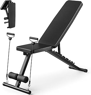
Adjustable Weight Bench for Home Gym
Adjustable Weight Bench for Home Gym has been one of the most consistently praised picks in this category. 517 reviewers averaged 4.5/5.
10. Hire A Pro For The Big Playlists

If you’re launching a massive fitness challenge or trying to grow a public playlist to thousands of followers, stop trying to do it yourself. I spent three weeks trying to design a cover for my 12-week powerlifting program playlist. It looked awful. I finally swallowed my pride and went on Fiverr. I paid a freelance graphic designer $55 for a custom illustration. I remember sitting at my kitchen island eating $3.49 peanut butter pretzels from Trader Joe’s while reviewing his first draft. It was ten times better than anything I could have made. Services like Cover Art Market also offer incredible premade and custom cover art in the $50 to $200 range. Quality custom artwork signals authority. When users see a professionally designed cover, they subconsciously assume the music curation is also top-tier. I wouldn’t spend money on a private mix I only listen to in my garage, but for a public-facing brand asset, it’s a necessary investment. A pro designer understands kerning, color balance, and thumbnail scaling way better than a meathead with a Canva account.
11. Add A Human Touch To Beat AI Slop

AI image generators are everywhere, and they all produce the same glossy, soulless, plastic-looking garbage. If I see one more AI-generated muscular lion wearing headphones, I’m going to lose my mind. To stand out in 2026, you have to incorporate an organic and imperfect human touch. I pay $10.99 a month for Spotify Premium, and I’ve been experimenting with their in-app beta cover art tools. They let you use custom typefaces and exclusive stickers, but I always take it a step further. I intentionally add film grain, rough edges, and ink bleed effects to my digital designs. I want my covers to look like they were printed on cheap paper in 1995 and left in the sun to fade. AI struggles heavily with nuanced, layered complexity and intentional imperfection. By adding a hand-drawn mark or a scanned texture overlay, you immediately signal to the viewer that a real human curated this music. The gym is a gritty, physical place. Your playlist art should reflect that physical reality, not a sterile digital fantasy.
Honestly, taking ten minutes to build a solid workout playlist cover changes the whole vibe of your training session. You aren’t just hitting shuffle anymore. You’re stepping into a specific environment you built for yourself. I highly recommend spending this Sunday afternoon organizing your top three mixes and giving them the visual upgrade they deserve. Save this guide, pin it to your fitness board, and start experimenting with those high-contrast colors today. Trust me on this.
Frequently Asked Questions
What size should a workout playlist cover be?
For optimal quality, create your cover at 3000×3000 pixels for Spotify or 4000×4000 pixels for Apple Music. Always use a strict 1:1 square aspect ratio. Keep the file size under 4MB and save it as a standard JPG.
What colors are best for a gym playlist cover?
Use bright reds and neon oranges for high-intensity or heavy lifting mixes, as they evoke energy and aggression. For yoga, mobility, or cool-down playlists, use greens and cool blues to promote focus and active recovery.
Can I use any image for my workout playlist cover?
No. You can’t use copyrighted photos, movie posters, or proprietary logos like the Spotify icon. Your cover will be rejected and removed. Stick to royalty-free image sites like Unsplash or create your own custom graphics.
What font works best for playlist thumbnails?
Use thick, bold, sans-serif fonts. Avoid thin cursive or overly chaotic maximalist text. Your title must be instantly readable when scaled down to a tiny 300×300 pixel thumbnail on a phone screen. Center the text for maximum impact.
